 ResumeFinch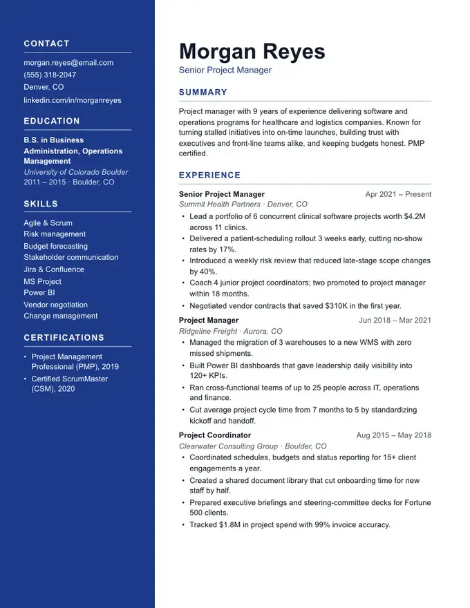
Anchor resume template
Solid colour sidebar
Two-column
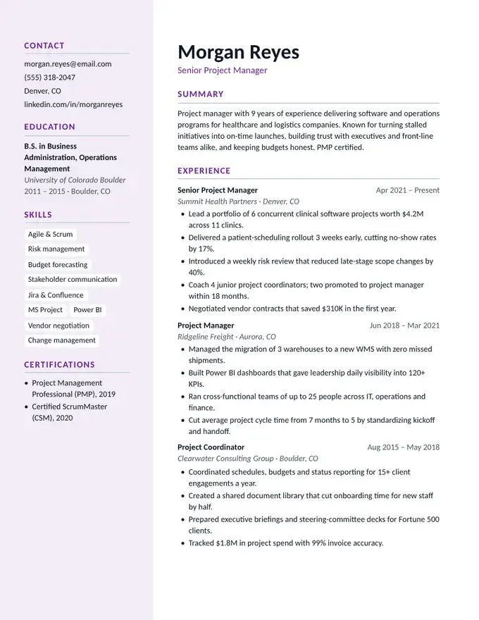
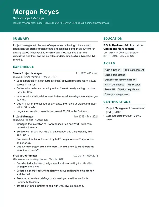
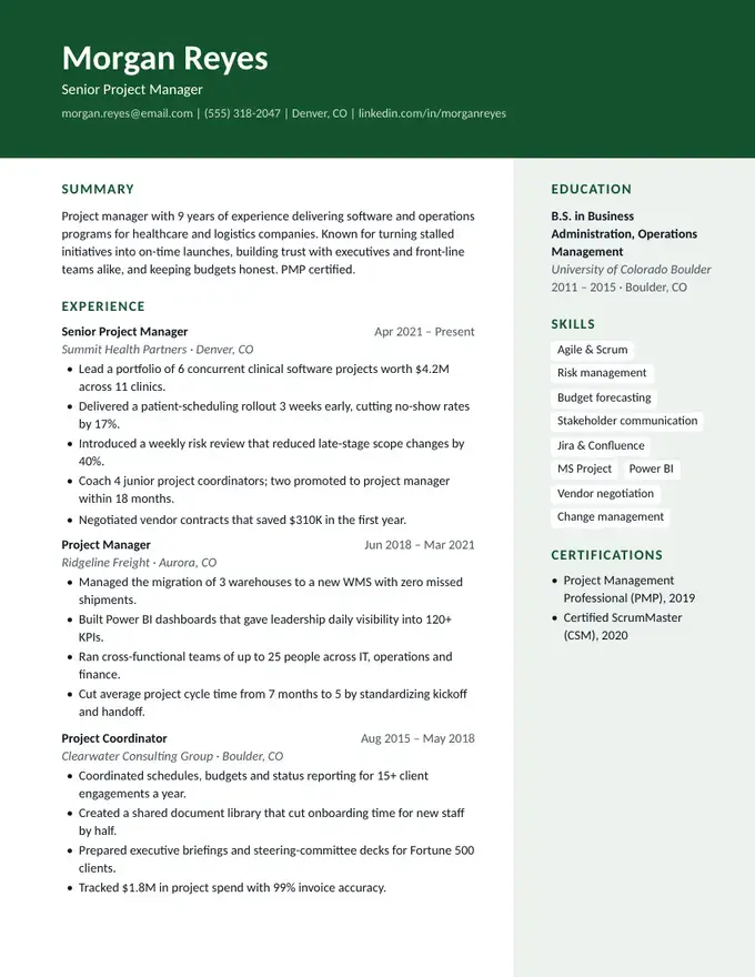
A two-column resume puts your experience in a wide main column and moves the short, scannable details (education, skills, certifications, languages) into a sidebar. You fit more on one page, and a reader sees your toolkit at a glance.
ResumeFinch has five sidebar designs, from Atlas's light sidebar to Anchor's solid colour panel, plus Ledger, which keeps your dates in a margin column. Each PDF is built so the text reads in the right order, main column first.
Free to build and preview. Downloads require a plan.
Two-column layouts are labelled design-forward in ResumeFinch. Modern applicant tracking systems read them, but some older systems read straight across the page and mix the columns together. If you're uploading to a large employer's online portal, an ATS-safe template such as Meridian or Keystone is the safer choice, and you can switch with one click without retyping anything.
Columns built from tables or text boxes are the main reason resumes fall apart in Google Docs. So the .docx download of a two-column template keeps its fonts, colours and headings but flows into a single column: experience first, then the sidebar sections. It opens cleanly in Word and Google Docs and reads correctly in any ATS. Use the PDF when you want the two-column look.
Not necessarily, but they're riskier. Newer systems parse them well; some older ones read columns out of order. Our PDFs put the main column first in the text, which helps, but for big-company portals a one-column template is the safest option.
Yes. Your content is separate from the design, so you can switch templates as often as you like and keep both versions.
The PDF keeps both columns. The Word file flows into one column on purpose, because table-based columns break when edited in Google Docs.
Solid colour sidebar
Modern sidebar panel
Bold header, right sidebar
Colour header, tinted sidebar