 ResumeFinch
Meridian resume template
Modern with a blue accent
Single column
A single column resume runs every section in one stack from top to bottom: header, summary, experience, education, skills. Because the text has only one possible reading order, it is the layout least likely to be scrambled when an applicant tracking system pulls it apart, and the quickest for a person to skim.
ResumeFinch has 10 one-column templates, compared below by header style, default spacing and fonts. The preview shows Beacon, the most expressive of them, filled in for a communications manager. The same templates serve as a single column CV template if you are applying somewhere that says CV and means resume.
Free to build and preview. Downloads are a one-time payment, no subscription.
Microsoft Word and Google Docs are trademarks of their respective owners; ResumeFinch is not affiliated with either company.
Every template here keeps all of its text in one column, so each one carries the ATS-safe label in the builder. They differ in the header, the spacing and the type, which the table lays out.
| Template | Header | Default spacing | Fonts | Best for |
|---|---|---|---|---|
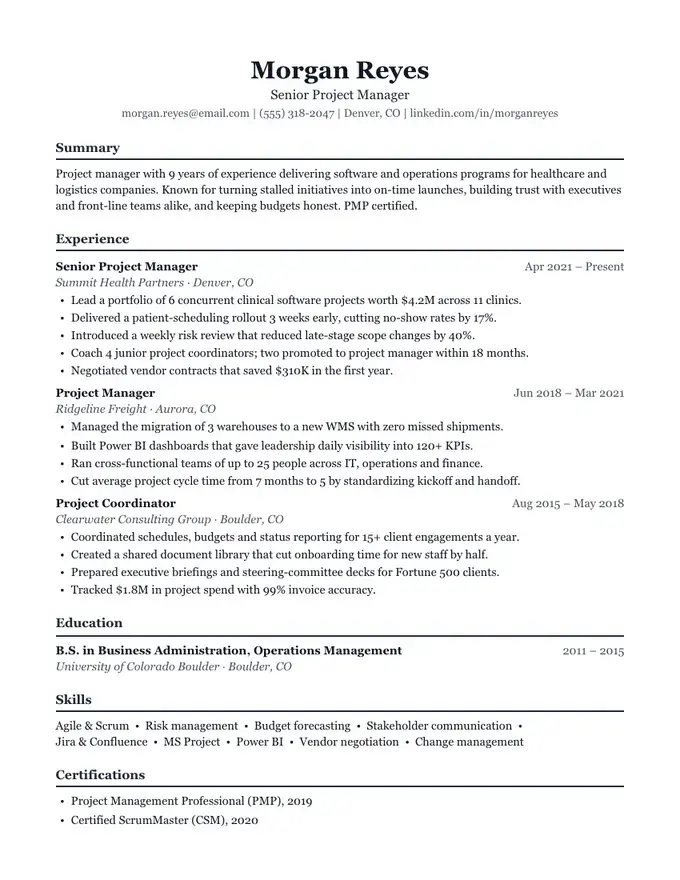
| Harbor | Name over a contact line, centered | Balanced | Georgia throughout | Finance and accounting; Law and government |
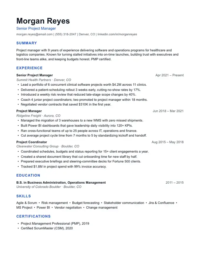
| Meridian | Name over a contact line, left-aligned | Balanced | Arial throughout | Tech and product roles; Marketing |
| Slate | Name over a contact line, left-aligned | Compact | Calibri throughout | Students and new grads; Entry-level roles |
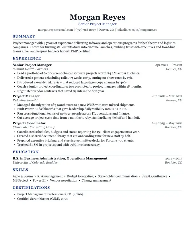
| Summit | Name over a contact line, left-aligned | Balanced | Georgia headings, Arial text | Managers and directors; Operations |
| Keystone | Name over a contact line, centered | Compact | Georgia throughout | Software engineers; Data and analytics |
| Campus | Name over a contact line, centered | Compact | Georgia throughout | College students; New graduates |
| Beacon | Two-weight name, centered | Balanced | Arial throughout | Marketing and communications; Sales and partnerships |
| Regent | Accent bar above the name, left-aligned | Balanced | Georgia headings, Arial text | Directors and VPs; General managers |
| Linen | Name over a contact line, left-aligned | Airy | Calibri throughout | UX and product design; Writers and editors |
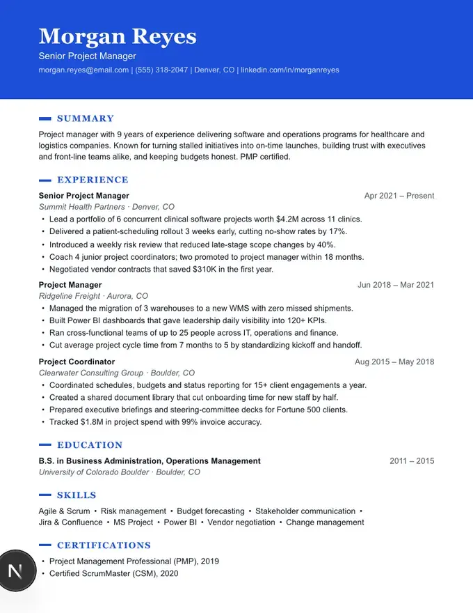
| Banner | Name on a color band, left-aligned | Balanced | Georgia headings, Arial text | Healthcare and nursing; Teaching and education |
An applicant tracking system does not look at your resume. It extracts the text and tries to split it into fields such as name, job title, employer and dates, and for that it needs the words in a sensible order. A PDF stores text as positioned fragments, and the parser has to decide which fragment follows which. With one column there is only one sensible answer: top to bottom.
A second column creates a second possible order. A parser that reads straight across the page can join the end of an experience bullet to a skill in the sidebar and produce a line that belongs to neither. Newer systems usually detect columns, but you rarely know which system a particular employer runs.
ResumeFinch checks reading order for every template it offers. The text of each PDF and Word file is extracted the way a parser would extract it and checked to come out header first, then the main content, with no line interleaved. One-column templates pass with nothing to work around. That is a test of our own files, not a promise about any specific employer's software.
The human reader benefits in the same way. A recruiter skimming on a laptop or a phone moves down one column exactly as the parser does, and a single column survives being printed, forwarded or pasted into an email without falling apart.
| Your situation | Pick | Why |
|---|---|---|
| Applying through a large employer's online portal | One column | You cannot see which tracking system will read the file. |
| Emailing a PDF straight to a hiring manager | Either | A person reads it first, so choose the design you prefer. |
| Handing printed copies to people at a career fair | Either | Paper has no parser; scannability is what counts. |
| A long list of tools, languages or certifications | Two columns | A sidebar holds short lists without pushing experience onto page two. |
| Long, detailed bullets are your strongest material | One column | Full-width lines give each bullet room to breathe. |
| You will keep editing in Word or Google Docs | One column | The Word file of a sidebar template is rearranged into one column, so it will not match the PDF. |
| Finance, law, government or other conservative fields | One column | A conventional layout matches what readers in those fields expect. |
If the table points you to two columns, the two-column resume template page compares the six sidebar and margin designs and explains how each one handles reading order.
A few choices in the preview are worth copying. Numbers in the sample's bullets are placeholders; put your own in their place.
A one-column template downloads as a .docx with the same section order and spacing as the PDF, since there is nothing to flatten. If you expect to keep editing in Word or Google Docs after downloading, this is the main practical argument for one column: the file you edit looks like the page you previewed. Pages are US Letter size (8.5 x 11 in) in both files.
Yes, as a rule. With one column there is only one order the text can be read in, so there is nothing for a parser to get wrong. Many modern systems handle two columns too, but when you are uploading to a portal you know nothing about, one column removes the risk.
Slate, Keystone and Campus start at Compact spacing, the tightest setting, with 0.56 in page margins. You can also switch any other template to Compact in the design panel, and the builder suggests fitting to one page when a second page is barely used.
Yes. All 10 one-column templates take any of the nine accent colors, and Banner carries it in a full-width header band. Color in headings and bands does not change how the text is read by a parser.
Not if the header and headings do some work. A two-weight name, an accent color and clear section headings give a page character without adding a column. Hiring managers mostly judge the content; the layout's job is to get out of the way.
Single column describes the layout: one stack of sections instead of a main column and a sidebar. Single page describes the length. A one-column resume can run to two pages, and a two-column resume can fit on one. The one-page resume template page covers trimming to a single page.
Start with Beacon. You can switch templates anytime.
Modern with a blue accent
Color header, one column
Classic and centered
Dense and technical